APP Traducciones
Brand development and digital experience for a professional translation services business.
Clarity, translated into identity.
The Challenge
Create a recognisable, professional identity and a coherent website experience that communicate trust, clarity and the business services.
My Role
The client provides professional, legal and sworn translation services. According to the original brand manual, its audience includes international clients, particularly French-speaking customers from African countries. The identity needed to communicate clarity, speed, reliability and respect in the handling of official documents.
Language without barriers.
APP Traducciones specialises in professional, legal and sworn translations. Its clients include people from francophone African countries navigating the translation of official documents. The brand needed to express precision, security and clarity without losing a human, accessible tone.
Brand positioning
A professional yet approachable identity built around trust, accuracy, agility and multicultural understanding. The communication tone is direct, clear and solution-oriented.
Design response
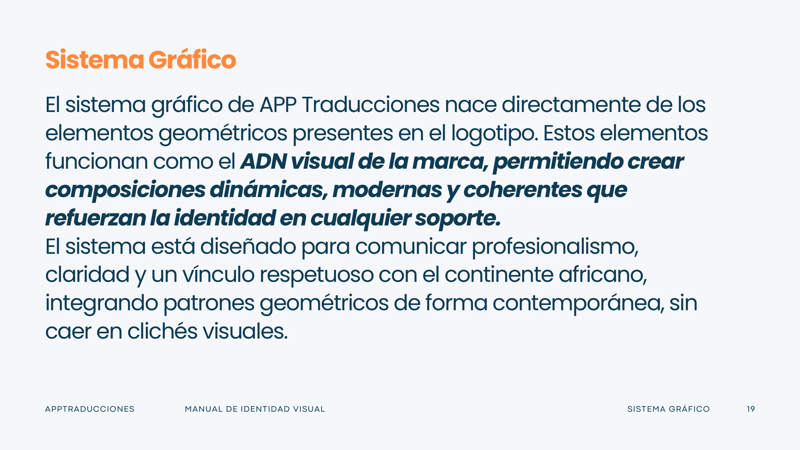
A distinctive identity with a logo rooted in the brand’s audiences and purpose, a coherent geometric graphic system, approved variations, and consistent applications across print and digital touchpoints.
The complete visual system.
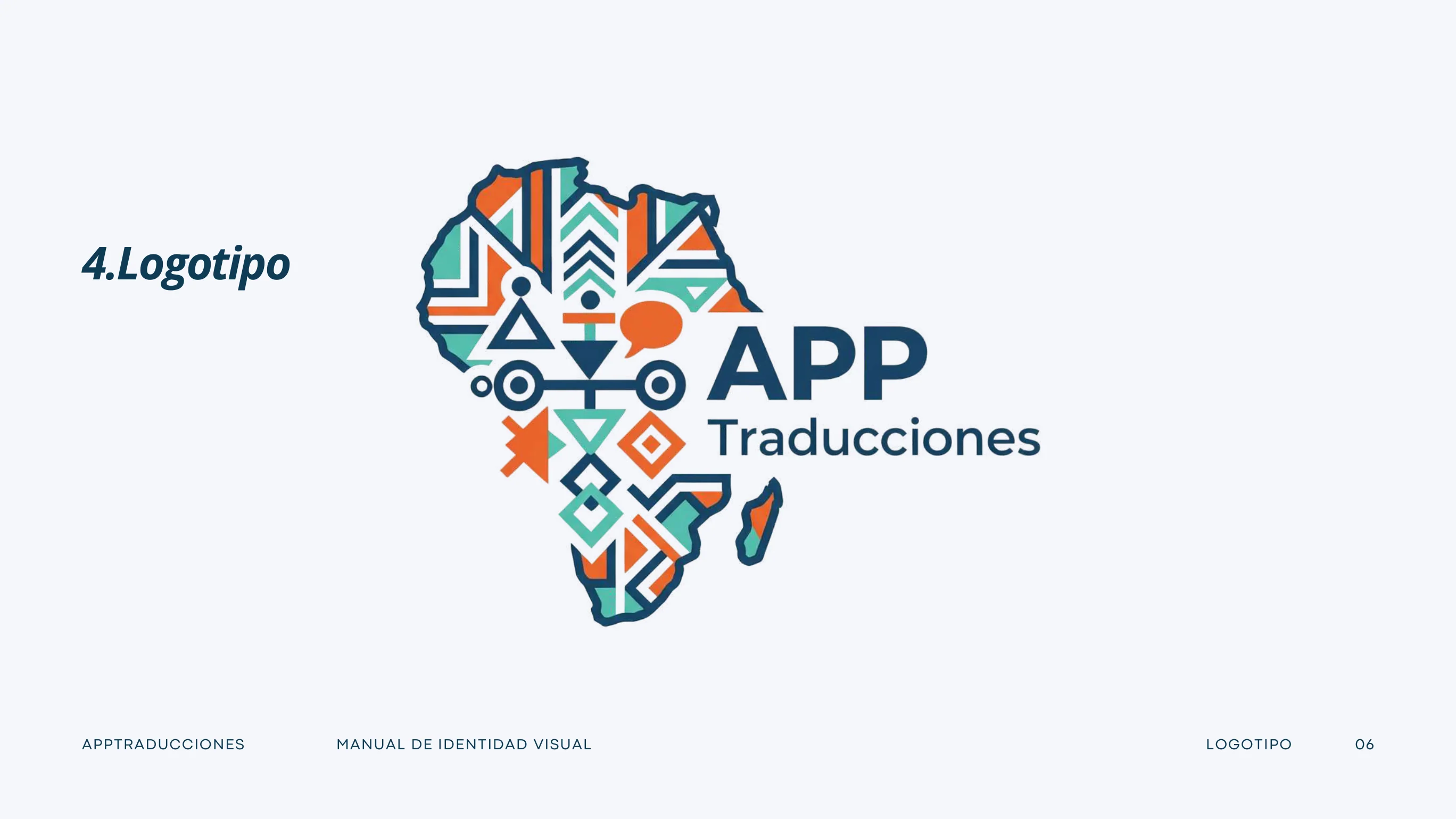
The original logotype combines a stylised map of Africa with a modular geometric graphic system. This is an asset extracted directly from the client's approved visual identity manual.
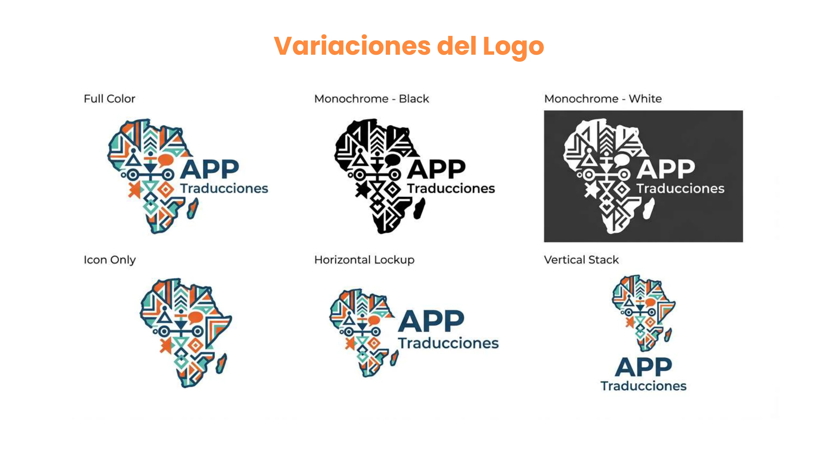
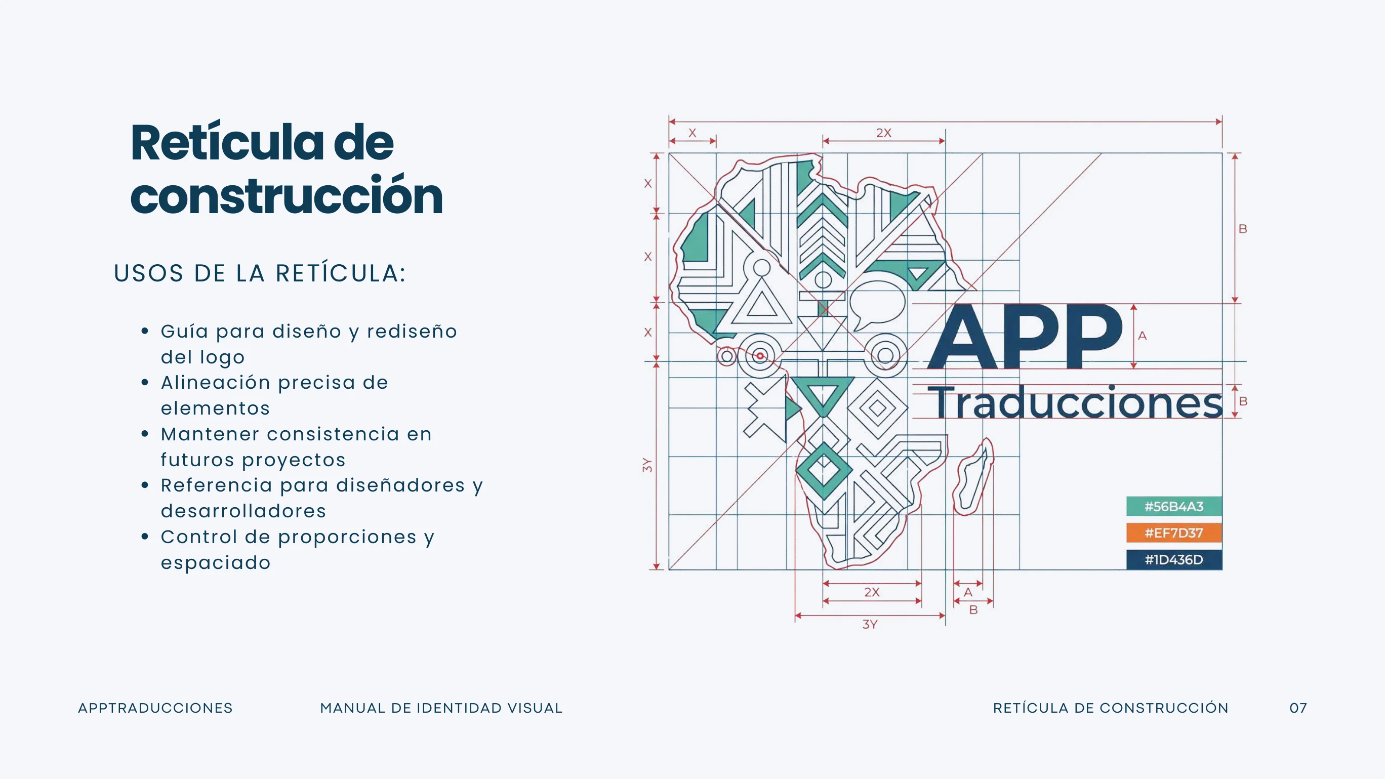
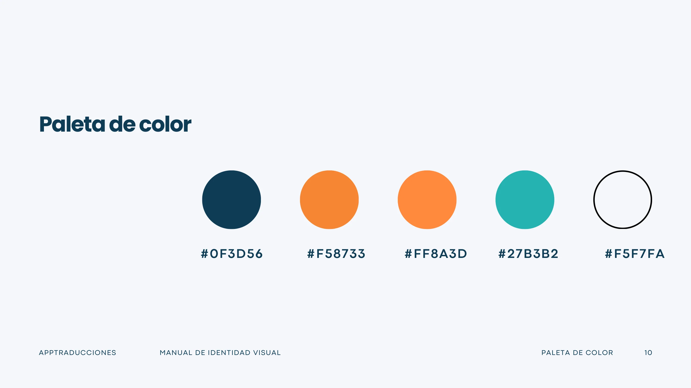
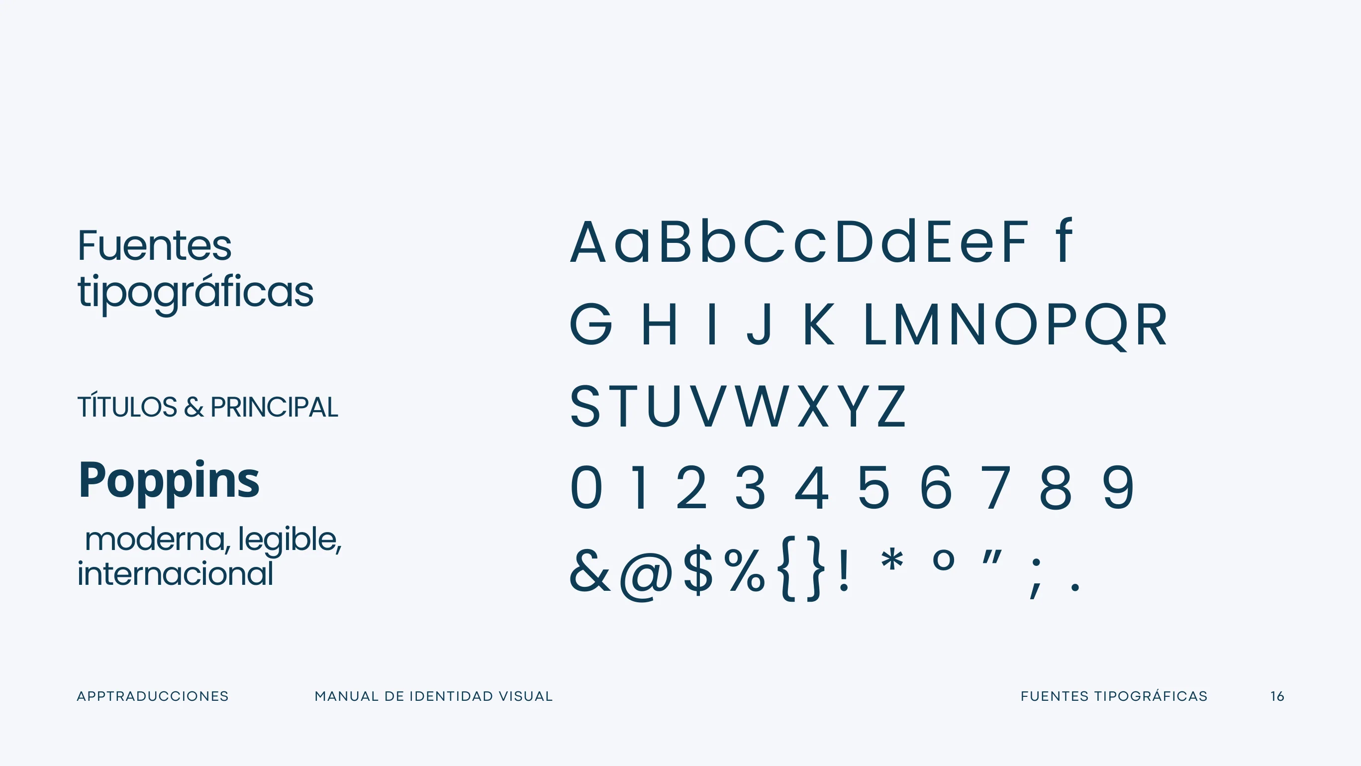
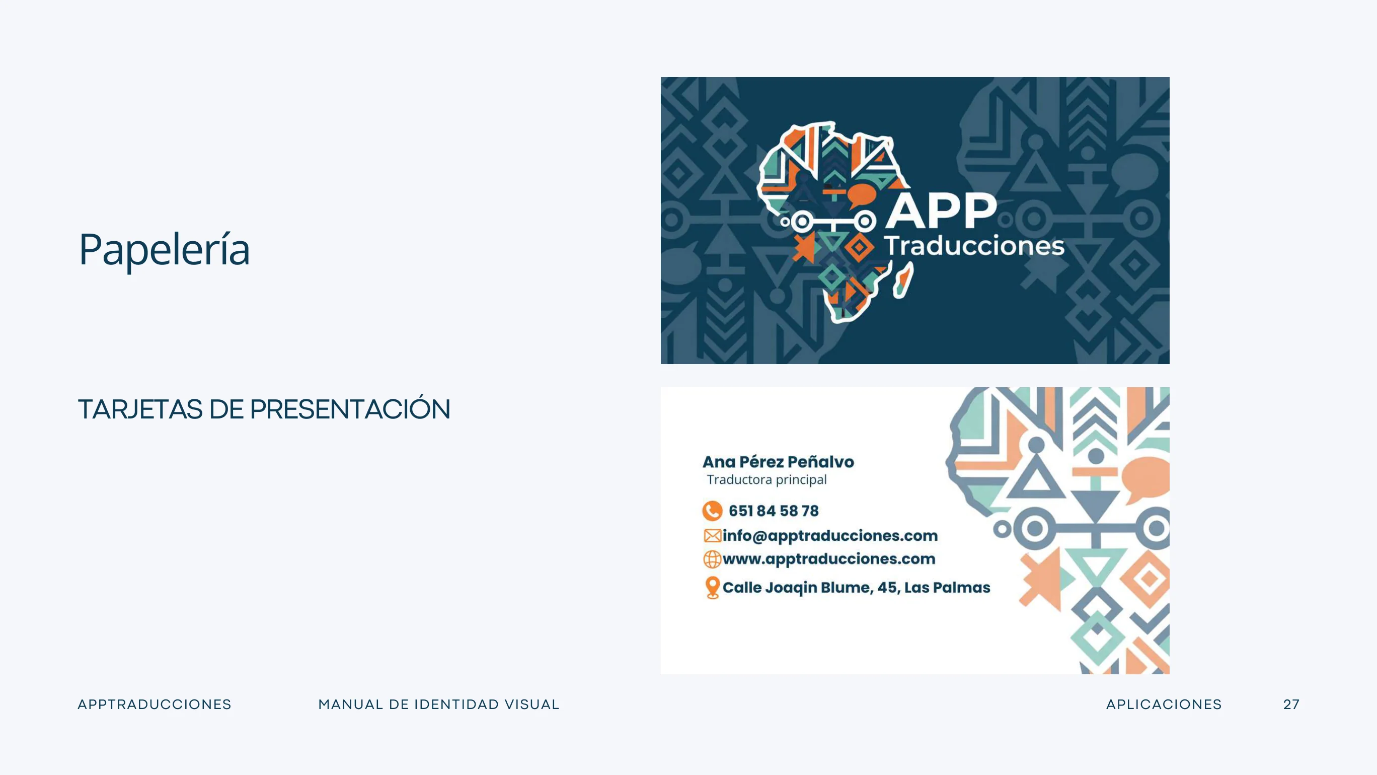
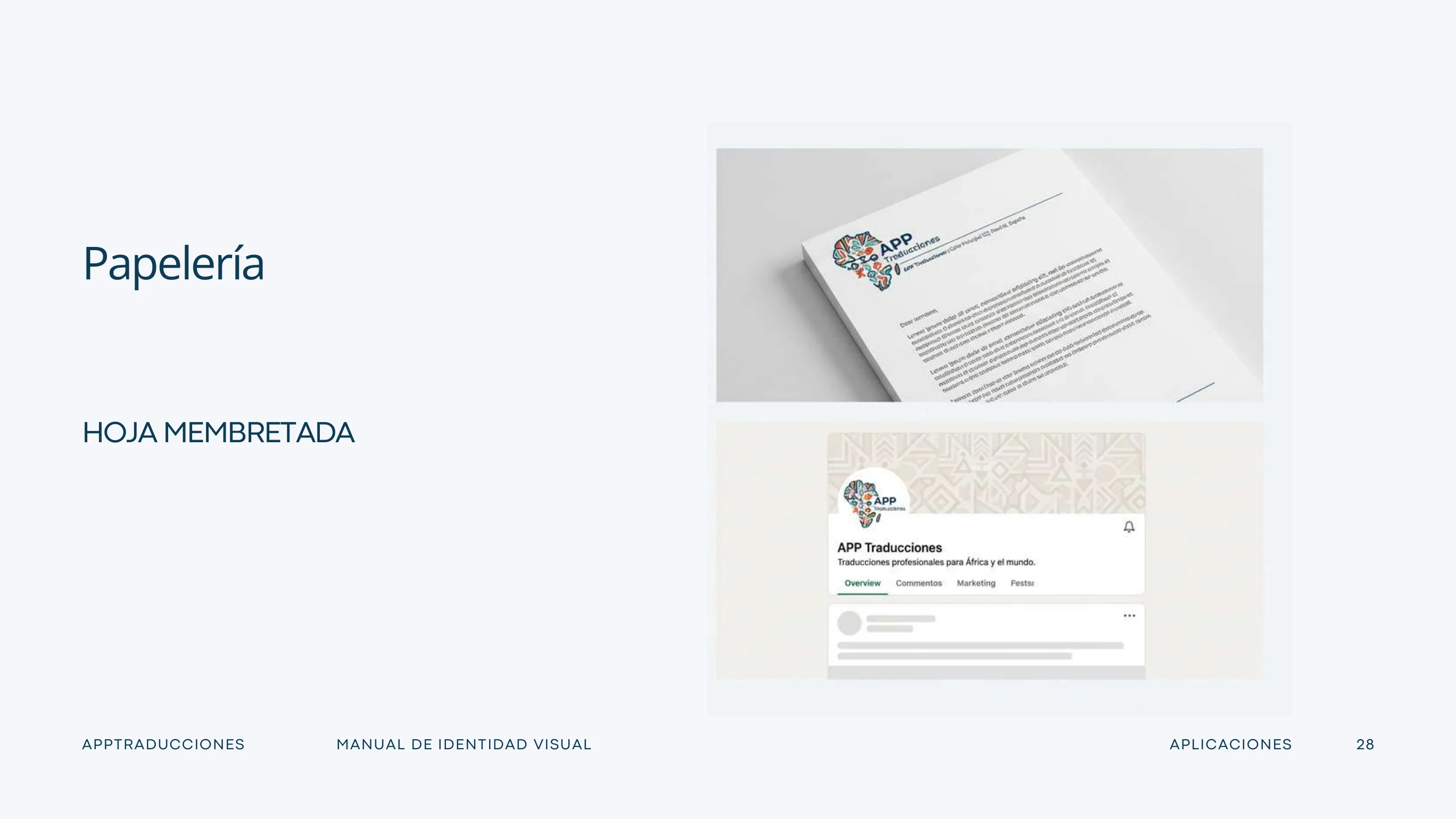
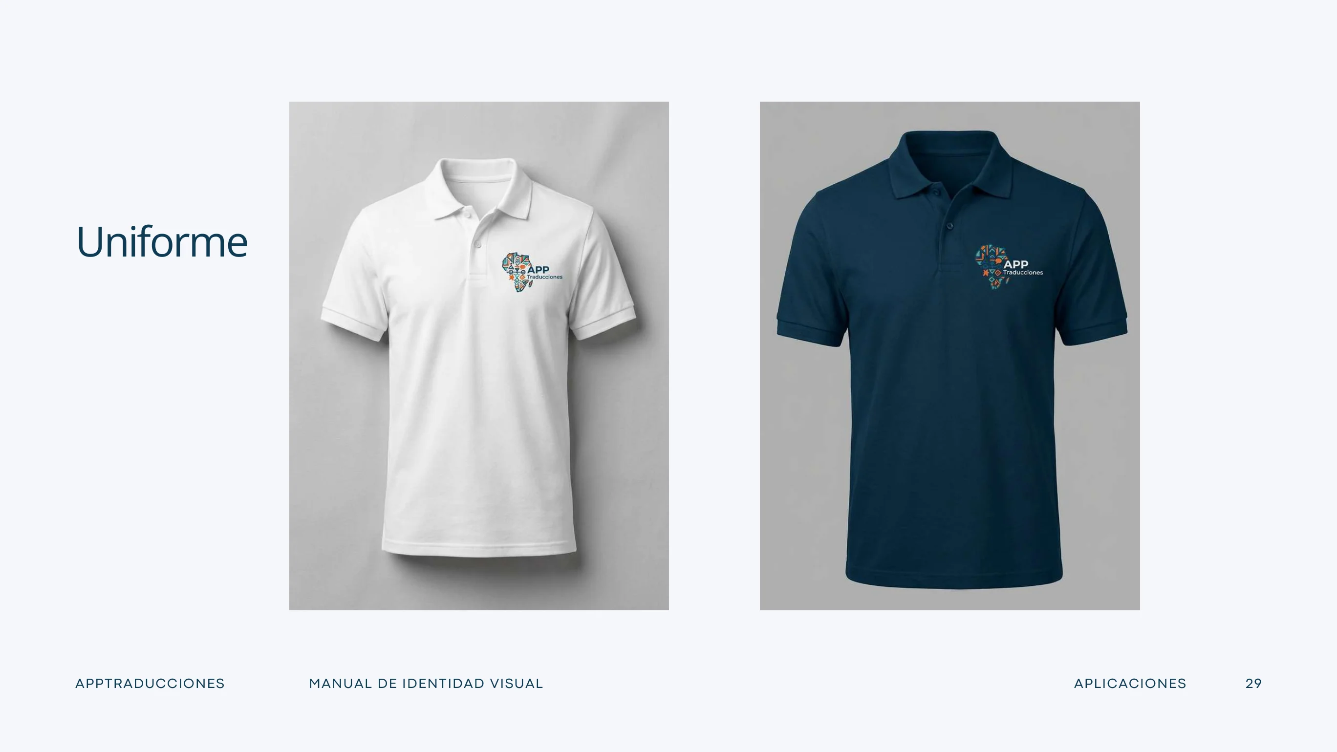
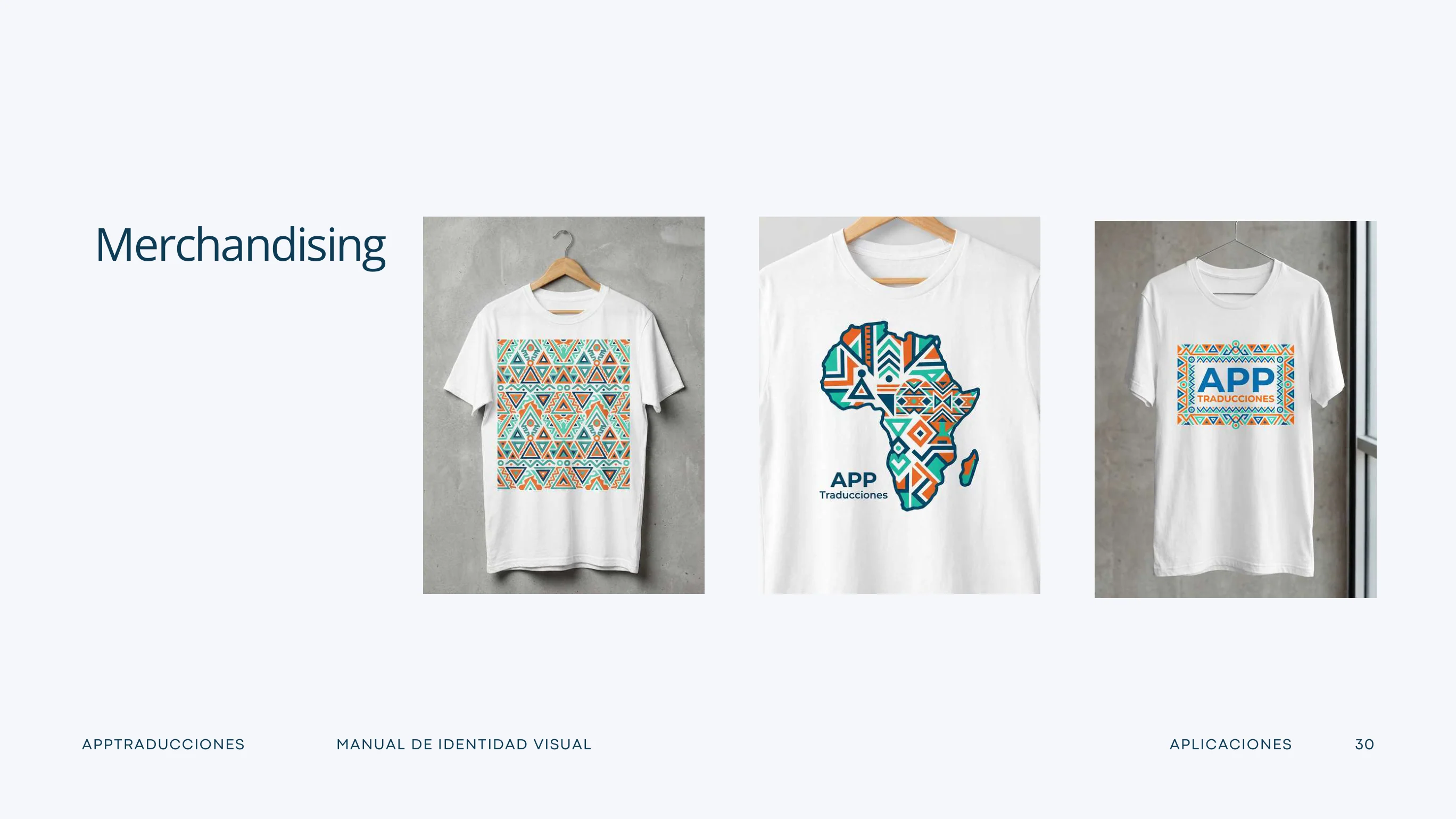
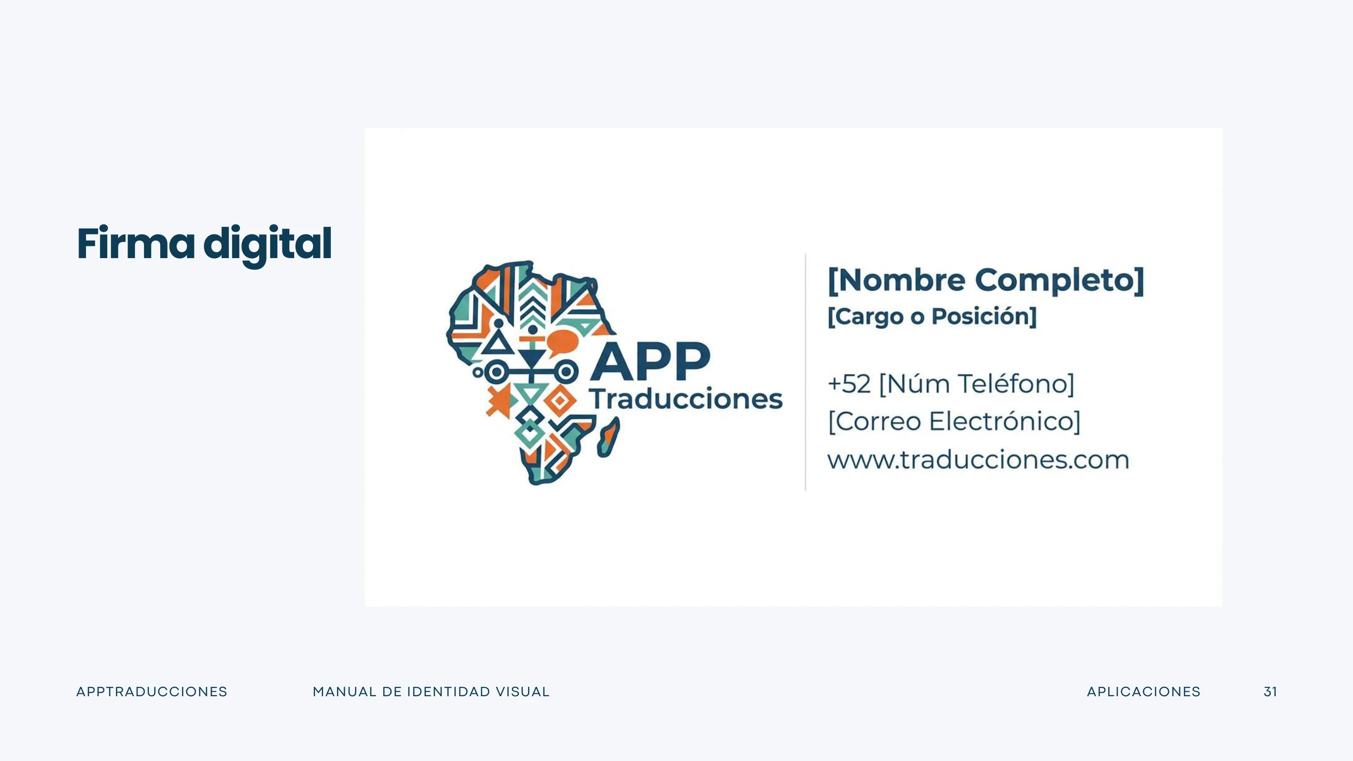
The identity includes a central logo, approved variants, construction and exclusion rules, colour, typography, geometric graphic motifs, iconography and brand applications. The visuals below are taken directly from the original 34-page brand manual.
These are the client's original approved brand colours, distinct from the palette of this portfolio. Typefaces documented in the manual: Poppins, Open Sans Bold and Roboto Condensed.
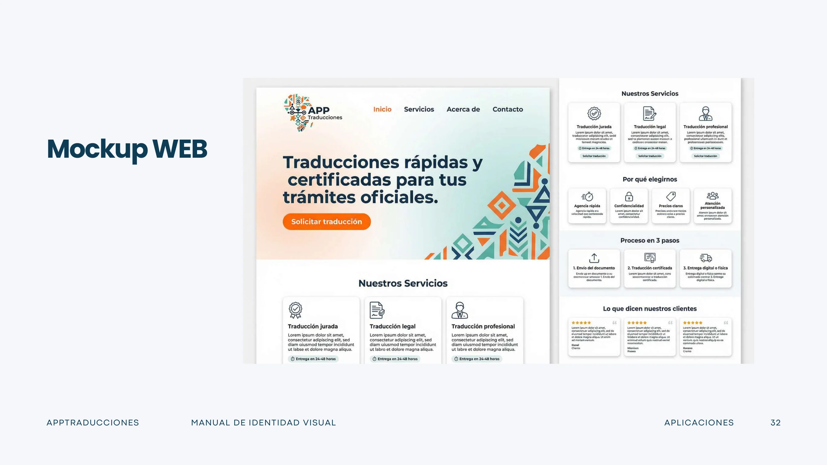
From identity to digital experience.
Structure and clarity
The website mockup translates the visual system into an accessible service presentation, using a clear information hierarchy and a consistent design language.
Actual deliverables
The available manual includes logo variants, typography guidelines, colour codes, brand stationery, apparel, merchandise, email signatures and a website mockup. All images displayed above come from that document rather than reconstructed AI imagery.
What the work delivered.
A coherent brand and website presentation built around consistency, visual hierarchy and professional communication. This portfolio does not claim unverified business results.